|
|
|
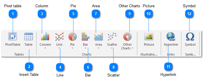
 Pivot table
| |
 Insert TableInsert a table.
| |
 ColumnInsert a column chart. Column charts are used to compare values across categories.
| |
 LineInsert a line chart. Line charts are used to display trends over time.
| |
 PieInsert a pie chart. Pie charts display the contribution of each value to a total.
Use it when values can be added together or when you have only one data series and all values are positive.
| |
 BarInsert a bar chart. Bar charts are the best chart type for comparing multiple values.
| |
 AreaInsert an area chart. Area charts emphasize differences between several sets of data over a period of time.
| |
 ScatterInsert a scatter chart, also known as an X Y chart. This type of chart compares pairs of values.
Use it when the values being charted are not in X-axis order or when they represent separate measurements.
| |
 Other ChartsInsert a stock or radar chart.
| |
 PictureInsert a picture from a file.
| |
 HyperlinkCreate a link to a Web page, a picture, an e-mail address, or a program.
| |
 SymbolInsert symbols that are not on your keyboard, such as copyright symbols, trademark symbols, paragraph marks and Unicode characters.
| |
|
|
|
|